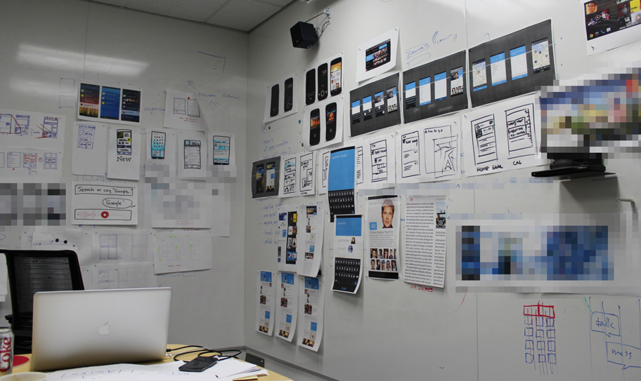
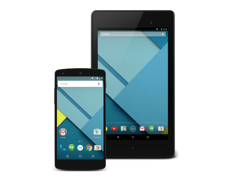
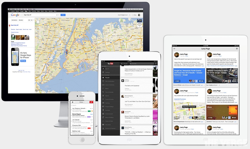
 In 2007 Apple introduced the iPhone and created a digital design standard and Google was working on the design of Android. Google was still focusing on function over form and they helped turn Android into an extremely powerful operating system that lacked the kind of polish consumers were looking for because of iOS. Around this time I was trying to choose my next phone and found the ubiquity of the iPhone off putting and considering that I took enjoyment in many geeky things in my life I found Android fit my personality just right. The evolution of Android from Cupcake to Jelly Bean has been incredibly dramatic and by fair the largest inflection point came with the arrival of Matias Duarte. Former lead designer for Palm's webOS his design ideas have brought Android to the point where it has become both beautiful and powerful. Matias has even introduced design guidelines to help unify the Android experience across applications. Now that Android is beginning to look good on its own, Google has turned to iOS. The new apps Google has released for iOS are nothing short of stunning, and what is equally as incredible is that they do not have the same design language as their counterparts on Android. The design language has apparently developed by committee within Google with each team building upon the next and pushing the style to create a beautiful digitally native look to everything Google does.
Google Now is the single most important update to come to the Android ecosystem as it brings together many areas Google has become an expert in. The Google Now platform brings in information from Maps, Gmail, Search, and Calendar to name a few and the creators decided to create a unique look for it to reflect the combined strength Google Now has been given. The flow and symplicity of Google Now and Google Glass are a new direction for Google.
No comments:
Post a Comment